
Tags
There are many ways to handle the challenge of depicting the three-dimensional Earth on a two-dimensional map. Each has its advantages and drawbacks, such as distortions in the size and shape of landmasses. I think a simple Robinson or Winkel-Tripel projection does a fine job, but others would argue that any rectangular shape is inherently illogical. For these deep thinkers, we have the Dymaxion or Goode Homolosine. The most unusual one of all, the Waterman Butterfly projection, may actually be the most accurate, at least according to its creator Steve Waterman. But I still find it incredibly disorienting and hard to use.
One of the most intelligent and hilarious webcomics, xkcd, created the below graphic to explain what your favorite map projection says about you. The Theory of Knowledge blog brought this to my attention, and it tickled me in just the right way.
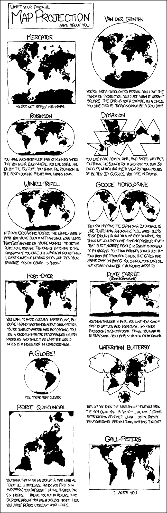
Via XKCD, http://xkcd.com/977/
