
Tags
calendars, design, ical, maps, time, visualization, wall calendar
Just as maps guide us through space, calendars guide us through time. In the days before computers and smart phones, we relied on wall calendars to tell us such critical information as what day of the week it was and how many days remained until the next holiday. But calendars still serve an important function in the digital world, by giving us new ways to visualize the flow of time and our place within it.
The traditional calendar design, in the Western world, is to order the dates in each month into rows and columns, moving left to right from Sunday until Saturday (though some do start their weeks on Monday). This is fine for business, and it makes it easy to see what day of the week it is, but it can also play tricks on our mind. It makes days in the same week seem closer together, while days in different weeks seem farther apart, even if there is the same span of days between them. For example, Tuesday to Friday seems like hardly any time at all (especially during a busy work week), while Monday feels like an incredible distance from Friday (which may be our own wishful thinking that the weekend was longer). The effect is even more pronounced between months, since calendars often do not include the dates from the next month at the bottom of the calendar sheet, and if so, the numbers are of a lighter shade. This helps contribute to the constant refrain of “how is it the 1st again already?” at the start of each new month. It is interesting that iCal, which comes on every Mac computer, phone, and tablet, continues the traditional calendar design, even though it has no technological constraints against creating something more true to life, such as a continually scrolling list of dates, unburdened by the artificial structure of weeks and months.
So, I have put together a little collection of interesting and unusual calendars from around the internet to show how the design style can affect how we think about time. To begin, here is one that follows a traditional design, but note the illustrations for each month. Like symbols on a map, they give us signs about the significance of each month from a cultural perspective:

via Ecka & Pecka – http://www.eckaandpecka.com/wp-content/uploads/2013/09/ecka-pecka-2014-calendar.jpg
Next is a calendar from Russia which displays a different architectural style each month. The one below is on biomorphism, and it’s from August, but if you follow the link under the picture, you can see the other 11. I like how the dates are arranged all in a row, emphasizing that the distance between dates is equal. The weekends are indicated by a different color.
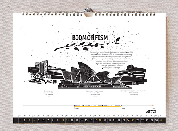
A linear calendar style in Russian, showing a different architectural style per month (via Tatiana Zhu – http://www.behance.net/gallery/calendar/4514529)
Here is a circular style which looks kind of like a sea shell. Again the dates in each month are lined up in a row. The only way to tell the day of the week is by the fact that Sundays are in red. For business, this is not ideal, but it still gives a fresh perspective.

A circular calendar style (via http://photo.elsoar.com/2014-calendar-ready-to-printable.html)
This is another circular style, though each month is in a separate circle. It also shows the phases of the moon. This provides a naturalistic way to describe each day. After all, what does it really mean if it’s a Wednesday or a Thursday? How can we even tell the difference? If we strip away all the human conventions we apply to the days, the one thing we can do to confirm each day’s uniqueness is to look at the moon.
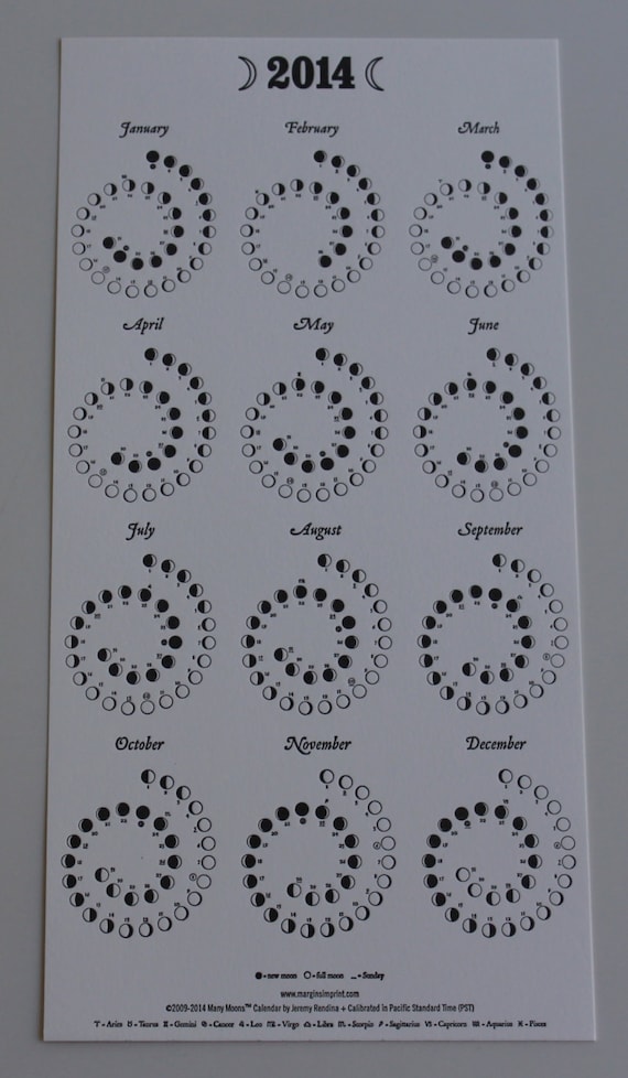
Circular moon phase calendar (via Etsy – http://www.etsy.com/listing/55038144/2014-moon-calendar-in-moon-surface?ref=sr_gallery_40&ga_search_query=calendar&ga_view_type=gallery&ga_ship_to=US&ga_search_type=all)
This is a vertical style, with the dates of each month descending down from the top. For each day, you pop out the blank circle to reveal the color behind, and soon enough you have a very colorful design, which also clearly indicates the current day. With this perspective, the flow of time is downwards, and it almost feels like each day is a drop of water dripping down until it reaches the bottom.

Jumping Point White 2013 Long Poster Calendar by Domberger (via http://www.calendars.com/Business-and-Office/Jumping-Point-White-2013-Long-Poster-Calendar/prod201300002539/)
Here is another vertical map, but this time the numbers are in two different columns: weekdays and weekend days. Since most people already view these two types of days so differently anyway, this is a useful visualization. During the work week, we’re on track 1, toiling away, and then when Saturday hits, we switch to track 2 for fun and relaxation, before switching back to track 2 again on Monday.

Another vertical style, separating weekdays on the left with weekend days on the right (via http://design-milk.com/2014-modern-calendars/2013-cal-vertical-make-collaboration/)
Below is one of the more unusual ones I’ve seen. It has each day of the year lined up in a grid, but the rows are not arranged by week or month. As you can see, the beginnings of each month appear throughout the grid, without any sort of pattern. The days start at the bottom, with February 1 (January has been cut out), and go right to left, bottom to top, until reaching December 31. According to the website selling the map, when each day is over, you can pop out the square and remove it. That’s one way to keep your mind on the future rather than the past.

A grid style calendar for the whole year, going from the bottom to the top (via http://design-milk.com/2014-modern-calendars/2014-cal-perforated-calendar-wrongforhay/)

Hi, of course this piece of writing is in fact good and I
have learned lot of things from it on the topic
of blogging. thanks.
Pingback: The Top Five Blog Posts of the Year | Petros Jordan
Pingback: More Unusual Calendar Designs | Petros Jordan